Table of Contents
By now, you’ve likely seen what long-scrolling pages have to offer. These are the unique pages that seem to go on forever when you scroll down a website. They can be effective when it comes to storytelling for your brand, products or services, but they also have some practical challenges.
For instance, some designers and marketers believe that putting much of your content below the fold is a death sentence for conversions and getting your message across. After all, no one really scrolls below the fold, do they? Not quite, although that’s been the conventional wisdom for some time.
On the other hand, you could argue that long-scrolling pages do away with the need for pagination, which has been considered cumbersome and a big user-experience problem.
So the jury may still be out on long-scrolling pages, but that just means it’s well worth it to dig deeper and examine the good and bad of this design choice.
The Good
Brand Storytelling
Brand storytelling is what sets your business apart from the competition. It establishes an emotional connection with your target market and gives them something substantial to relate to. With the Harvard Business Review saying that you should use good storytelling to motivate people, it’s clear that this strategy can be extended to business branding, too.
A long-scrolling page—which is not the same as infinite scrolling, just to be clear—is the ideal design venue for brand storytelling. As with turning the pages of a book, each time a site visitor scrolls down the long page further, he’s able to discover more about what makes your brand unique and what your unique selling proposition is.
This is the perfect opportunity to slowly but surely unfurl more of your brand story to your visitors, as the Seattle Space Needle’s site has so excellently done.
This site is very unique because the long scroll is actually initiated from the bottom of the page up, whereas more long-scrolling sites would have the traditional top-to-bottom scroll. As you can see, visitors to this site learn about the city of Seattle, the Needle’s restaurant, and its observation deck.
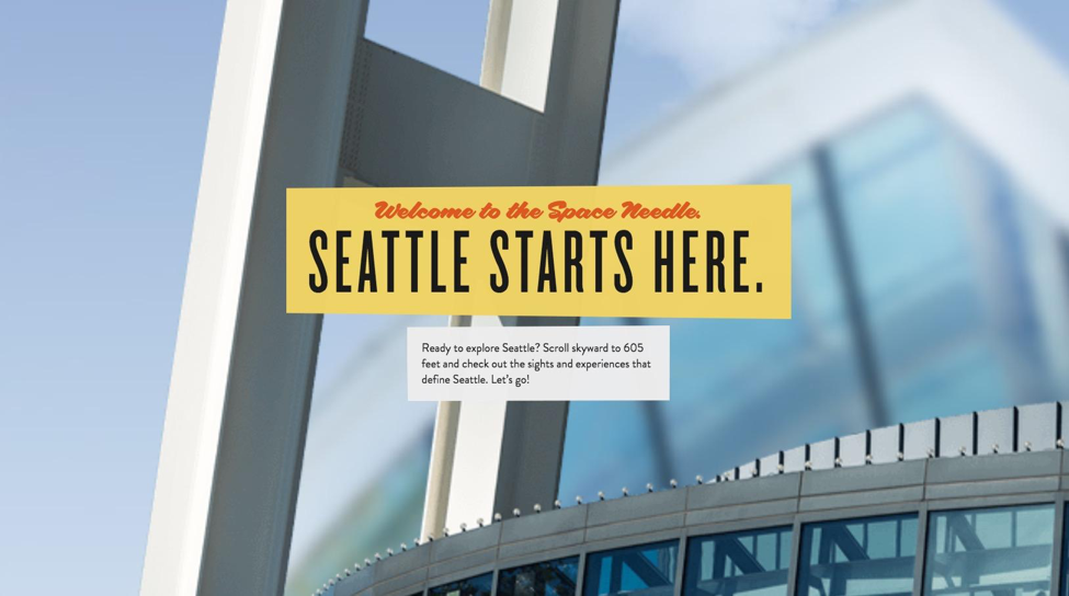
Image from Space Needle
As a result, budding tourists understand more about Seattle and the role of the Space Needle in the city’s identity. Because it’s presented in a gradual, chapter-by-chapter way, visitors are told the story and get more engaged with the idea of visiting the Space Needle.
Getting Rid of Pagination
Pagination is a web-design element that has been around for many years, but long scrolling is making it obsolete rather quickly. Pagination is showing only a limited number of results on a search engine results page (SERP) or articles/posts on a site, with links to additional pages displayed at the bottom of the current page.
While this system of organizing web content was meant to increase order, the opposite has happened. Usability and user experience issues abound with pagination, as there are numerous questions surrounding:
- What to name the pagination links to different pages (for instance, should you use “next” and “previous” links?)
- How many links to various pages should be displayed on screen
- Whether or not there should be a link to the first and last pages
When your content is just one, long page, the question of how to divide this content into pages and appropriately number and link to them becomes moot. That’s why the user experience benefits when you have a long-scrolling page.
A perfect example of this is the Apple Watch’s page. Each feature of the watch opens up to another page that features a longer long-scrolling page where the feature is broken down into a lot more detail.
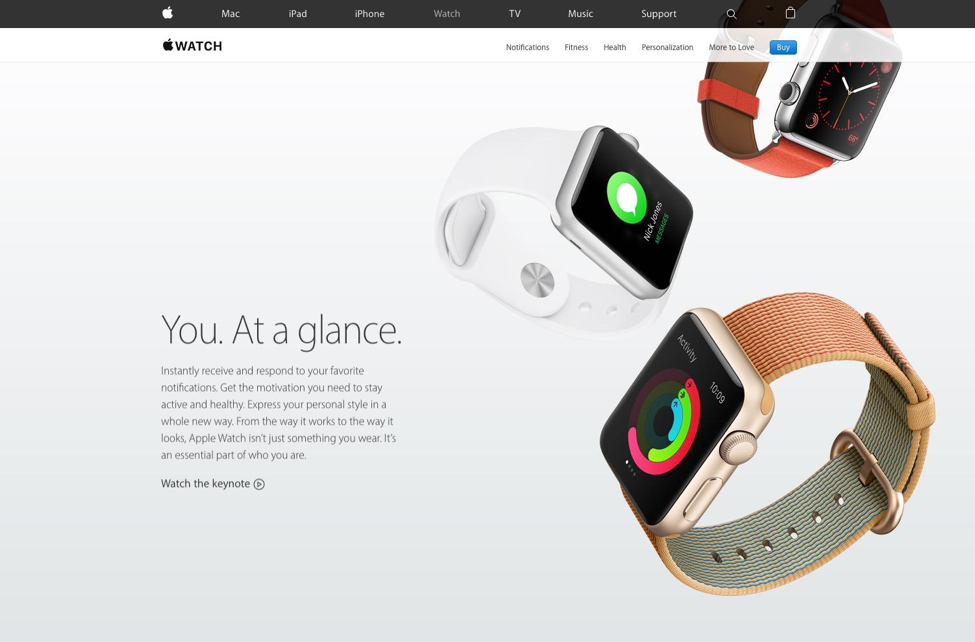
Image From Apple
Imagine the hassles of organizing this content with regular, old pagination! From a UX standpoint, it would, first of all, be more cumbersome to have to individually click on each, new page to reveal more content instead of just smoothly scrolling down. Second, how do you decide how many of the details of each feature make it onto a page?
Long scrolling eliminates these headaches.
We’ve talked about the pros of long scrolling, yet there are also some cons.
Much of the Content Lives Below the Fold
Whether to put content below the fold or not has been an argument that web designers and marketers have been having since the advent of the Internet. The fold, of course, is the bottom-most part of a site that you see on a page that you land on, before you scroll down.
Below the fold opponents will say that no one (or barely anyone) actually scrolls down, so it’s a waste to put important content below the fold. Below the fold proponents will say that the fold doesn’t impede people from scrolling down since, if your top of the fold content is high-quality and persuasive enough, they’ll gladly scroll down to devour more content.
The research tends to support this view about below the fold adversity. A Google study determined that ads below the fold are only viewed 44% of the time, compared with ads above the fold being seen 73% of the time. Clearly, fewer people scroll down.
Slow Site Speed
Unsurprisingly, long-scrolling pages are sometimes noticeably slow because of the storytelling factor that, in and of itself, is still a plus. However, when you figure that storytelling involves a lot of images, graphics and even video, then all of these elements combine to really slow down the speed of a site, which is frustrating on the UX.
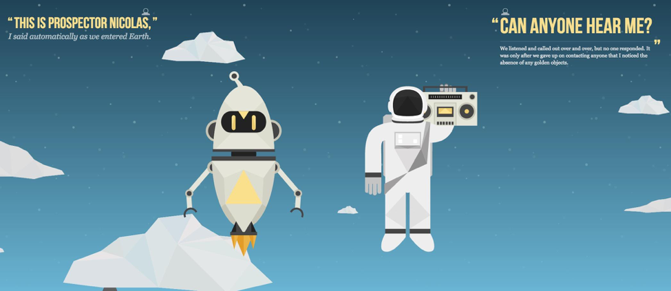
Image From NASA Prospect
One such long-scrolling page is NASA Prospect, a student site that was created in collaboration with NASA. This is a really, really long scroll down, as it tells a long story, but the UX of the site suffers. Scrolling down the page, you experience scrolling that’s cumbersome and noticeably slow with the appearance of more images. This is an experience that continues down the entire length of the page.
A Design That’s Increasingly Popular
Long-scrolling design started a few years ago. At the time, people thought it was very interesting, and it was accordingly well-received. What’s clear at this point is that long scrolling is more than just a trend or a fad.
When huge brands and authority figures like Apple prominently feature this design in their sites, then you know it’s going to stick around for a while to come.
More and more brands are deciding that they can effectively use the storytelling angle of long-scrolling pages to seamlessly communicate their brand messaging to leads and customers. It may also be something that you decide is right for your brand.
source:Big Drop
This article was originally published in 27 July 2017. It was most recently updated in November 28, 2022 by